Websites for Legal and Advisory.
Professional services sell judgement, and judgement is invisible. The site is the only evidence a prospective client has before the first call, so it has to read as considered rather than templated.
What the site has to do
- Look like the fees you charge A cheap site is an argument against your rate, made before you open your mouth.
- Be specific about what you do "Full service" tells a client nothing. The matter type they searched for should be on the page.
- Make the first contact easy and private A short enquiry form, clear about what happens next and who reads it.
- Say who you are People hire a person. Real names, real faces, real history.
What do people actually type into Google before they call a lawyer?
People rarely search the name of a practice area. They search the actual problem in their own words: can my landlord keep my bond, or what happens if I'm hit by an uninsured driver. A page written in that language gets found. A page written only as Family Law or Litigation does not.
This is not about dumbing anything down. It is about naming the actual matter, in the words a worried person types at midnight, somewhere on the page, alongside the proper legal term for anyone who already knows it. Both readers need to find the same page and recognise it as theirs.
The firms that show up for these searches are usually the ones that wrote a page for the actual question, not just a list of services. It reads as understanding the problem before the client has even called.
Does a law firm need to publish its fees?
Not every figure, but the shape of them, yes. Saying whether a first conversation is free, whether a matter is quoted as a fixed fee or charged by the hour, and roughly what stage a client finds out the number, answers the question every visitor is quietly asking before they will pick up the phone.
Silence on this reads as expensive by default, because a worried client fills the gap with their worst assumption. A firm that is upfront about how pricing works, even without a dollar figure on the page, reads as one with nothing to hide about it.
If it helps to see how this plays out on the website side of the equation, what a small business website should actually cost walks through the same kind of pricing honesty from the other side of the table. The same logic, naming the shape of a cost even without a final figure, holds just as well for a fee page as it does for ours.
How private does a legal enquiry form need to be?
As private as the matter itself, which for most legal enquiries means more than a name and a message box. A short note on the page about who reads the enquiry, and that it is not shared beyond the person handling the matter, is often what turns a hesitant visitor into someone who actually presses send.
The form itself should ask for only what is needed to start a first, useful conversation. That means the general area of the matter, and a way to reply, with space to say as much or as little as feels comfortable. Anything that reads like an intake questionnaire before a client has spoken to anyone puts people off.
A short line about what happens next, and who will be in touch, closes the loop that most enquiry forms leave open. Most people are not being difficult when they hesitate over a legal form, they are protecting a matter that already worries them.
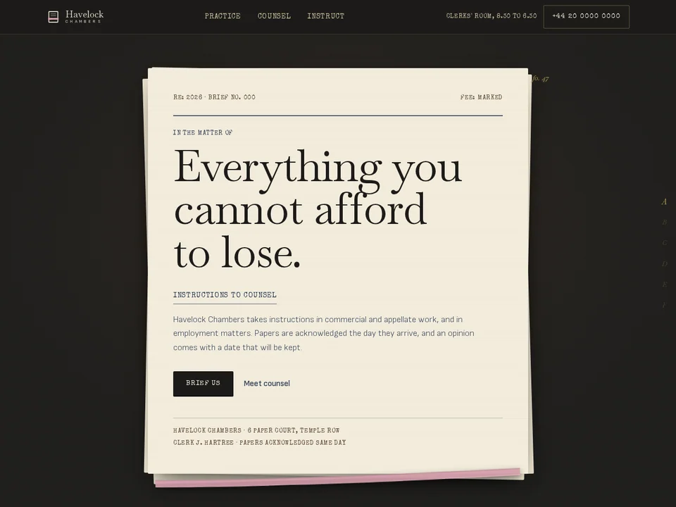
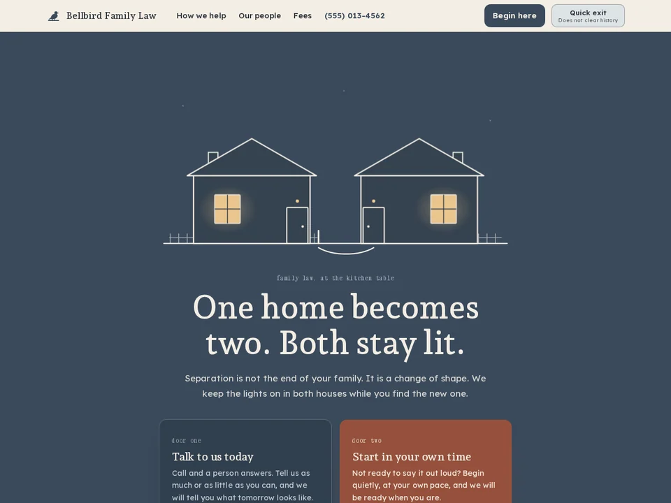
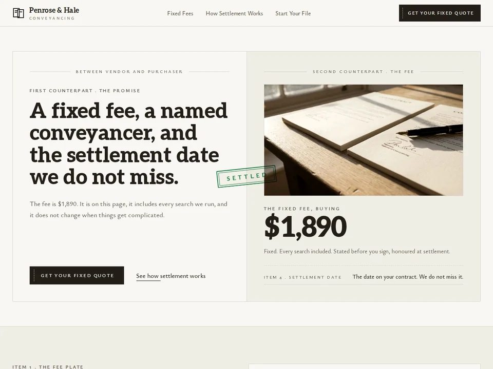
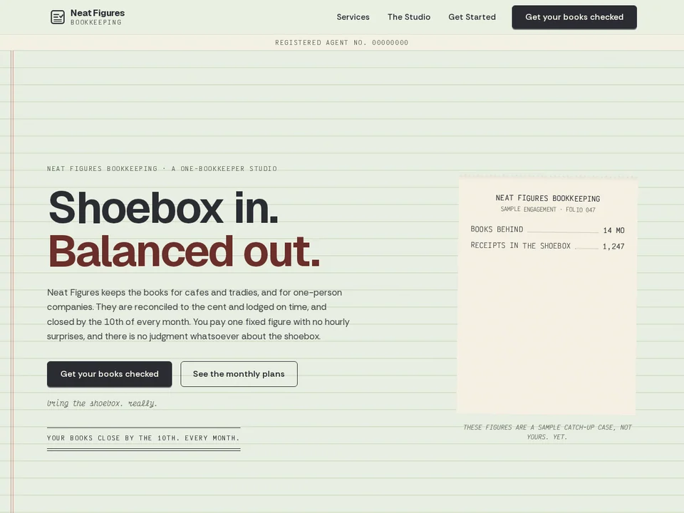
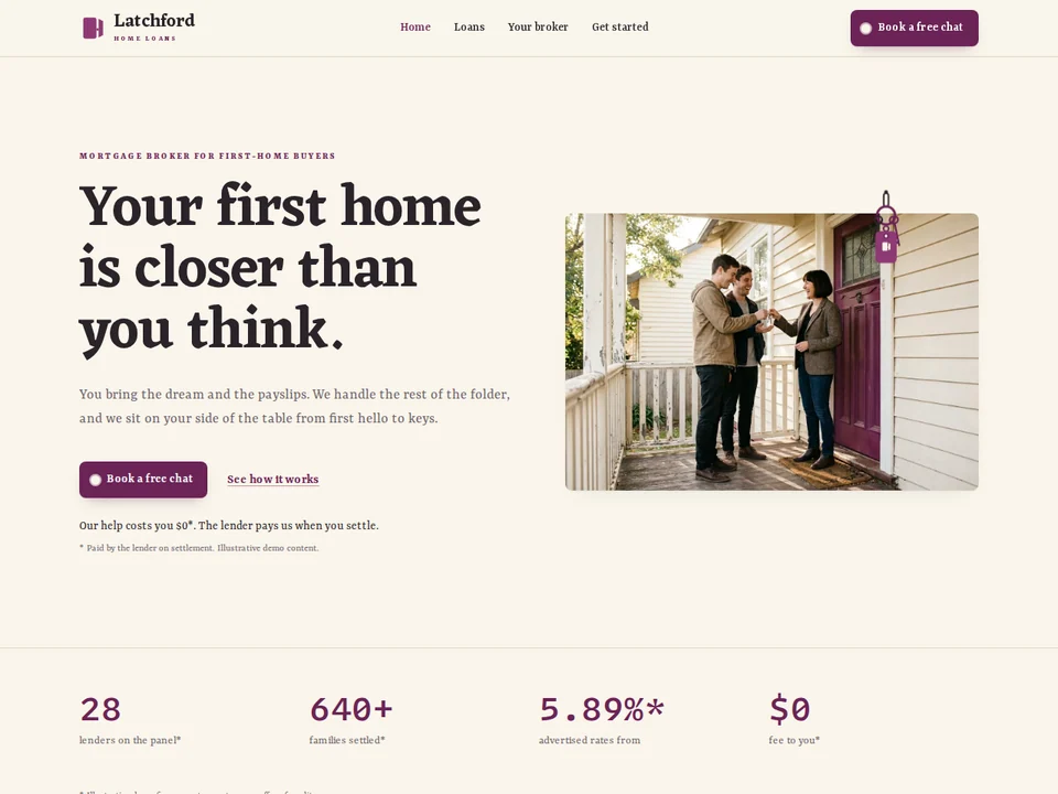
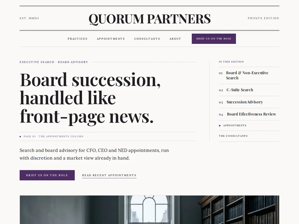
Find that Perfect Template.


Want us to build Yours?
The kind of site people screenshot and send to their web guy. Tell us about the business, get an instant quote, and we build from your brief.